Sempera Organics New Brand Identity

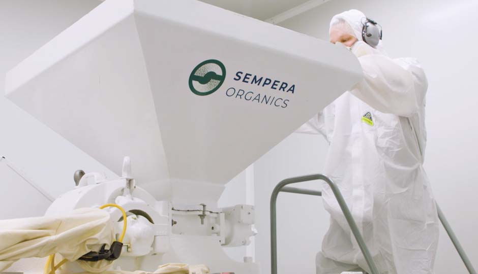
Behind the doors of Sempera Organic’s seemingly typical Silicon Valley office is an unexpected surprise: a mushroom farm. To be a bit more accurate, it is a lab farm. In this state-of-the-art, sterile, climate controlled facility, a steady supply of the highest quality mushroom products are produced for a range of applications, from functional foods, nutraceuticals to cosmeceuticals.
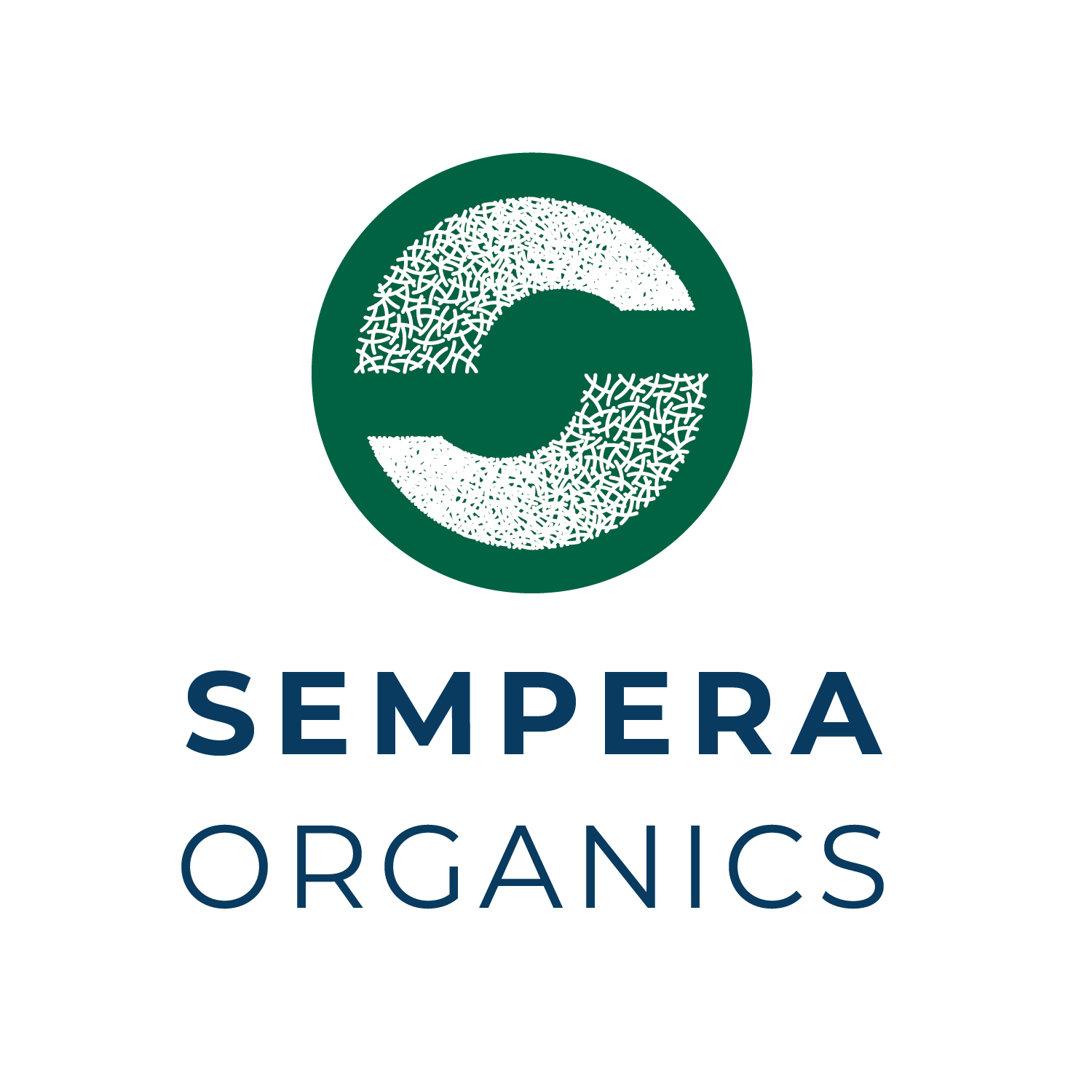
We were tasked with creating an identity for this innovative new company. The brand mark depicts the core of their products: mushroom mycelia, the network of cells that grow to create all parts of the mushroom. The mycelia is a beautiful spiderweb-like network of cells and is the foundation of all mushrooms. In the brand mark, we created a stylized network of these “cells” representing mycelia. They grow and repeat in an organic way to form two parts of a circle that come together to form the “S” in “Sempera.” By placing this white symbol on a dark green background, it further reinforces the look of real mycelia in the natural world, which is most often white strands growing within a darker substrate.
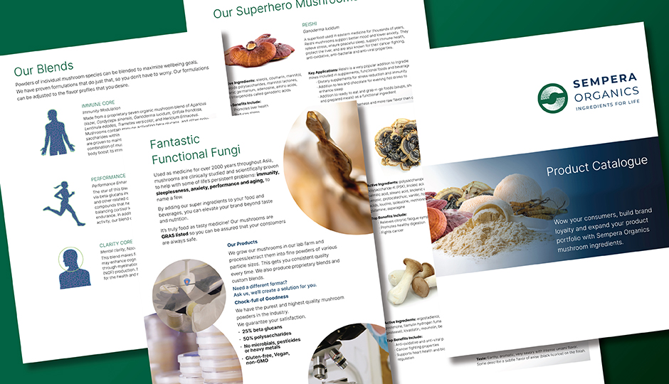
The goal overall is to create an identity that symbolizes the company and what it does: creating natural, organic ingredients and products grown in a modern, environmentally sustainable way. Clean, crisp typography combined with rich colors and an almost wild network of cells that grow within a contained circle come together to symbolize the contrast of laboratory and farm, nature and technology.


