Refresh: Charge Across Town Brand Identity
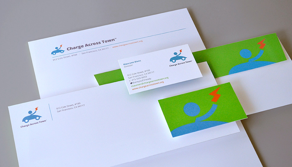
Charge Across Town is a non-profit working to get more electric cars on the road and reduce carbon emissions in the Bay Area and across California. In 2012, we were approached to create a new identity for this fast-growing and hard-working organization, and the various programs and campaigns they sponsor, such as EV Week, Driving on Sunshine and eMobility. Charge Across Town partners with government agencies and corporations, but focuses on educating consumers. As such, our original identity needed to be simple, accessible, and convey the fun of this somewhat new mode of transport. It also had to speak to electric vehicles and the organization’s forward momentum.
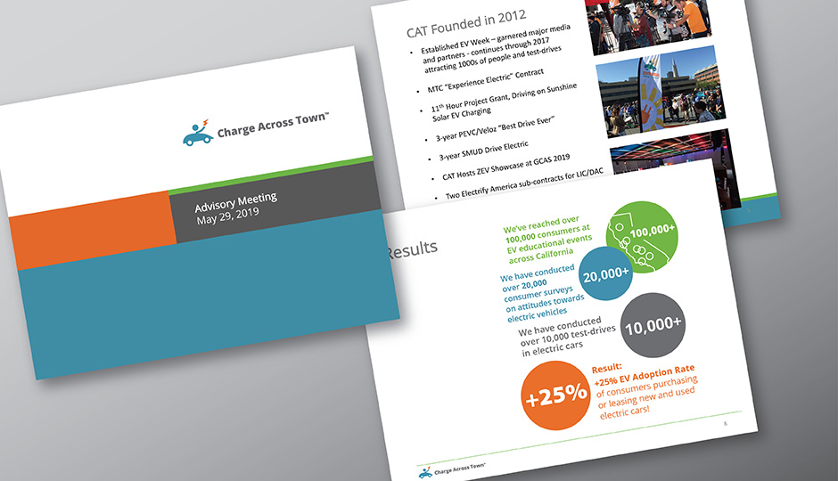
After seven years of continued growth and extending their reach across California, we were asked to refresh the brand identity as the organization evolves. New electric transportation options are available, from plug-in hybrid, all-electric and hydrogen fuel cell cars, to electric bikes, scooters and boards, plus more electric options in ride-share services.
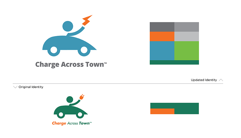
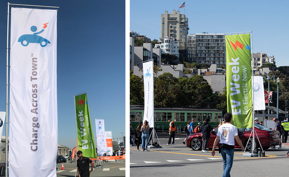
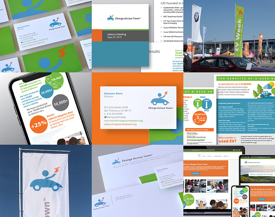
The solution involved an updated brand mark that kept the core of the original’s streamlined illustration style and playful, energetic tone. We added a spark symbol that more generally refers to electricity and not just vehicles that are plugged in. We introduced a new typeface that has a modern, approachable feel and is more flexible for use in a variety of applications from print, web and mobile to large scale event signage. And we developed a new color palette that could work with the original so that existing event banners and signage could be used alongside new pieces, preventing unnecessary waste — an important factor for a budget-minded non-profit.
The updated brand identity reflects the success Charge Across Town has had in helping to make California the largest market for electric vehicle adoption in the nation and supports their efforts to “lead the charge” in reducing carbon emissions going forward.