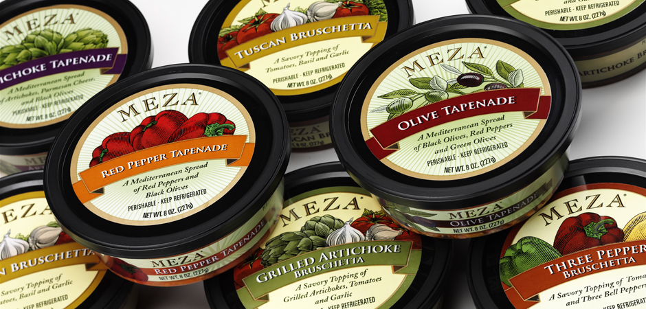
Meza Tapenades
Meza was launching a new line of gourmet Mediterranean spreads and came to us looking for labels that would truly reflect their artisan quality. These new products were all about the simplicity and authenticity of the ingredients—and our packaging follows suit. Etching-style illustrations highlight the key ingredients in each product and give an overall hand-crafted, importedfeel. Rich, deep colors grab the eye and draw it in. Minimal copy on the label keeps the look clean, simple and pure and allows the etchings to take center stage. The result is a distinctive old-world look that conveys the products’ exclusivity, unites the entire product line, while also setting Meza spreads apart from their competitors.