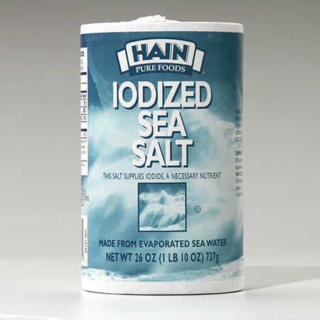
Hain Sea Salt
Hain’s core line of Sea Salt was in need of a packaging refresh. While dated, the old packaging was recognizable at the shelf. To keep those recognizable visual cues, we kept the overall blue color, but brightened it up. Imagery of sea waves was updated to a modern image of a tranquil sea and sky with clouds. Elegant typography and Hain‘s newer, full-color logo were added to the design. The result is a package design with a fresh approach that relates to the old but looks to the new.

BEFORE