PR & Company Identity
When asked what PR & Company does in the simplest terms possible, the answer was “change perceptions.” Public relations is all about changing the public’s perceptions of something – a product, organization or person – but the something stays the same. It is the perception or image of that thing that changes.
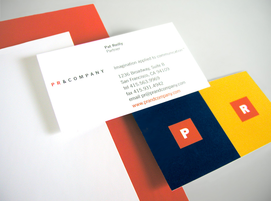
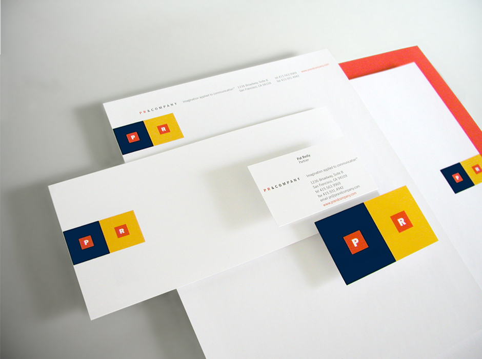
The original concept for PR & Company’s identity was simple: represent this change in perception via a study of color theory. When the same color is placed within two different fields of color, the same color appears different. While the color has not changed, its perception has, based on the influence of the color around it.
Placing simple red squares within contrasting yellow and blue squares creates a strong visual and a memorable brand mark. These bursts of bold colors, contrasted with clean typography and lots of white space combine to create an identity system that is appropriate across the range of clients they work with: social entrepreneurs, nonprofits, foundations and for-profits. Because of its simplicity and elegance, the identity has remained bold, impactful and kept pace with changing times.